 Home
Home Latest images
 Search
 Register
 Log in
What will the logo be?
Page 8 of 9 • ![]() 1, 2, 3, 4, 5, 6, 7, 8, 9
1, 2, 3, 4, 5, 6, 7, 8, 9 ![]()
![]()
 Re: What will the logo be?
![]() by Mrtweetums Fri Apr 30, 2010 4:11 pm
by Mrtweetums Fri Apr 30, 2010 4:11 pm
well, dexholder production sounds pretty cool! (I thought we had a poll on this too, though. Didn't we have pallet town studios as an option or something...)

Mrtweetums- Full Supporter

-


Gender :
Posts : 1356
Age : 124
![]()
![]()
Re: What will the logo be?
![]() by dabeatmaster123 Sat May 01, 2010 9:10 am
by dabeatmaster123 Sat May 01, 2010 9:10 am

dabeatmaster123- Audio Team

-
Gender :
Posts : 379
Age : 29 -

![]()
![]()
Re: What will the logo be?
![]() by Skotein Mon May 10, 2010 3:56 am
by Skotein Mon May 10, 2010 3:56 am
(You might have to right click it and view the image in a new window to see the whole thing. >.O)


Skotein- Audio Team
-
Gender :
Posts : 63
Age : 32 -
![]()
![]()
Re: What will the logo be?
![]() by videofan9864 Mon May 10, 2010 6:34 am
by videofan9864 Mon May 10, 2010 6:34 am
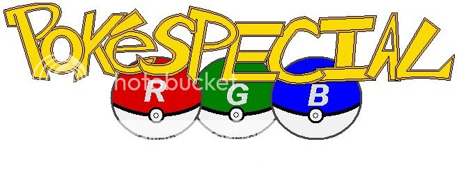
Skotein wrote:Sorry to burst out of nowhere, but how would something like this work? I could probably fix up the low-res-looking "Poké" bit later.
(You might have to right click it and view the image in a new window to see the whole thing. >.O)
Wonderful work:) In my opinion it is better than all the rest so far:)

videofan9864- Moderator
-
Gender :
Posts : 333
Age : 36
![]()
![]()
Re: What will the logo be?
![]() by TheViolentTomboy Mon May 10, 2010 7:29 am
by TheViolentTomboy Mon May 10, 2010 7:29 am

TheViolentTomboy-
Gender :
Posts : 50
Age : 32
![]()
![]()
Re: What will the logo be?
![]() by Aki11 Mon May 10, 2010 9:07 am
by Aki11 Mon May 10, 2010 9:07 am
http://images1.wikia.nocookie.net/__cb20080612073503/digimon/images/thumb/a/ac/Digimon02Logo.jpg/250px-Digimon02Logo.jpg
like the letterings are all encased in this red yellow.. thing<W<;; (personally felt that black for urs would do just fine>W<)
im all for this one tho8DDD

Aki11- Staff
-


Gender :
Posts : 1157
Age : 32
![]()
![]()
Re: What will the logo be?
![]() by Skotein Mon May 10, 2010 9:42 am
by Skotein Mon May 10, 2010 9:42 am
Skotein- Audio Team
-
Gender :
Posts : 63
Age : 32 -
![]()
![]()
Re: What will the logo be?
![]() by SaiTurtlesninjaNX Mon May 10, 2010 10:23 am
by SaiTurtlesninjaNX Mon May 10, 2010 10:23 am
Aki a digimon 02 style logo nice idea.
This I drew a while ago.

SaiTurtlesninjaNX- Staff
-
Gender :
Posts : 817
Age : 34 -
![]()
![]()
Re: What will the logo be?
![]() by Skotein Mon May 10, 2010 12:14 pm
by Skotein Mon May 10, 2010 12:14 pm
Working on the Digimon thang as I speak. ;0
Skotein- Audio Team
-
Gender :
Posts : 63
Age : 32 -
![]()
![]()
Re: What will the logo be?
![]() by Guest Mon May 10, 2010 12:36 pm
by Guest Mon May 10, 2010 12:36 pm
>.> Don't forget the 'Arc' haha xD
And nice logo Skotein~ ;w;
Guest- Guest
![]()
![]()
Re: What will the logo be?
![]() by Guest Mon May 10, 2010 1:38 pm
by Guest Mon May 10, 2010 1:38 pm
 )
)
Guest- Guest
![]()
![]()
Re: What will the logo be?
![]() by Skotein Mon May 10, 2010 1:42 pm
by Skotein Mon May 10, 2010 1:42 pm


Again, the "arc" is pretty difficult to fit into the logo without doing something crazy with it...hence the cloud. ^^;
Skotein- Audio Team
-
Gender :
Posts : 63
Age : 32 -
![]()
![]()
Re: What will the logo be?
![]() by SaiTurtlesninjaNX Mon May 10, 2010 1:47 pm
by SaiTurtlesninjaNX Mon May 10, 2010 1:47 pm
The logo look a little chidish.
Like how you put RGB in the cloud. I not fan of the pink bubble backgrund.
SaiTurtlesninjaNX- Staff
-
Gender :
Posts : 817
Age : 34 -
![]()
![]()
Re: What will the logo be?
![]() by Razor-Leaf Mon May 10, 2010 2:01 pm
by Razor-Leaf Mon May 10, 2010 2:01 pm


Razor-Leaf- Hyper Supporter

-

Gender :
Posts : 605
Age : 29
![]()
![]()
Re: What will the logo be?
![]() by Skotein Mon May 10, 2010 3:17 pm
by Skotein Mon May 10, 2010 3:17 pm

Last edited by Skotein on Mon May 10, 2010 4:51 pm; edited 1 time in total
Skotein- Audio Team
-
Gender :
Posts : 63
Age : 32 -
![]()
![]()
Re: What will the logo be?
![]() by SaiTurtlesninjaNX Mon May 10, 2010 4:27 pm
by SaiTurtlesninjaNX Mon May 10, 2010 4:27 pm
If you want to fit the hold thing in just make it smaller.
SaiTurtlesninjaNX- Staff
-
Gender :
Posts : 817
Age : 34 -
![]()
![]()
Re: What will the logo be?
![]() by Razor-Leaf Mon May 10, 2010 4:34 pm
by Razor-Leaf Mon May 10, 2010 4:34 pm
Last edited by Razor-Leaf on Tue May 11, 2010 2:31 pm; edited 1 time in total
Razor-Leaf- Hyper Supporter
-
Gender :
Posts : 605
Age : 29
![]()
![]()
Re: What will the logo be?
![]() by SaiTurtlesninjaNX Mon May 10, 2010 4:39 pm
by SaiTurtlesninjaNX Mon May 10, 2010 4:39 pm
It your talking about making it smaller so it can fix. You can just make it smaller before you upload it.
SaiTurtlesninjaNX- Staff
-
Gender :
Posts : 817
Age : 34 -
![]()
![]()
Re: What will the logo be?
![]() by Skotein Mon May 10, 2010 4:51 pm
by Skotein Mon May 10, 2010 4:51 pm
I think my brain needs to take a little break from the graphics. I know I can pull off something even more mature-looking than that, but no ideas have come to me yet.
Skotein- Audio Team
-
Gender :
Posts : 63
Age : 32 -
![]()
![]()
Re: What will the logo be?
![]() by SaiTurtlesninjaNX Mon May 10, 2010 5:05 pm
by SaiTurtlesninjaNX Mon May 10, 2010 5:05 pm
You have to changed the size upload it on the internet. I had to used MS Paints because that all I have. Here's like your logo which I made smaller by 50% for example. It's not a bad idea to have link to the original size.
Here's like your logo which I made smaller by 50%. By the look of it I think making smaller 80 to 60% smaller should work just fine.

A link to original size
SaiTurtlesninjaNX- Staff
-
Gender :
Posts : 817
Age : 34 -
![]()
![]()
Re: What will the logo be?
![]() by Joyfulldreams Mon May 10, 2010 7:57 pm
by Joyfulldreams Mon May 10, 2010 7:57 pm
=\ I am sticking with Aki's, but yours are good too.

Joyfulldreams- Illustration Team

-


Gender :
Posts : 1121
Age : 29 -
![]()
![]()
Re: What will the logo be?
![]() by Guest Mon May 10, 2010 9:20 pm
by Guest Mon May 10, 2010 9:20 pm
There's a difference everyone! We need to decide about a title screen on a different, new thread. People are getting confused. >>;
Guest- Guest
![]()
![]()
Re: What will the logo be?
![]() by SaiTurtlesninjaNX Mon May 10, 2010 9:22 pm
by SaiTurtlesninjaNX Mon May 10, 2010 9:22 pm
SaiTurtlesninjaNX- Staff
-
Gender :
Posts : 817
Age : 34 -
![]()
![]()
Re: What will the logo be?
![]() by Guest Tue May 11, 2010 12:11 am
by Guest Tue May 11, 2010 12:11 am
And when we reach yellow arc, the logo is going to be weird with just 'Y' letter alone. >.>
Guest- Guest
![]()
![]()
Re: What will the logo be?
![]() by Skotein Tue May 11, 2010 12:52 am
by Skotein Tue May 11, 2010 12:52 am
No offense taken, I like Aki's way better too. XD I was just sort of experimenting with different font types. I think Aki's general design is good, but maybe mixing up the font will make it look less generic.
Skotein- Audio Team
-
Gender :
Posts : 63
Age : 32 -
![]()
![]()
Page 8 of 9 • ![]() 1, 2, 3, 4, 5, 6, 7, 8, 9
1, 2, 3, 4, 5, 6, 7, 8, 9 ![]()
![]()